Live Spot
We developed the complete brand identity for Live Spot, an event production company specialising in expos, stages and exhibition stands. From the name and tagline to the logo, key visual and promotional materials, the system was designed to work seamlessly across digital screens, projections and print. The symbol, built from the company’s initials, became the core of a bold, flexible identity available in vibrant and dark variants.

Wiosna architects
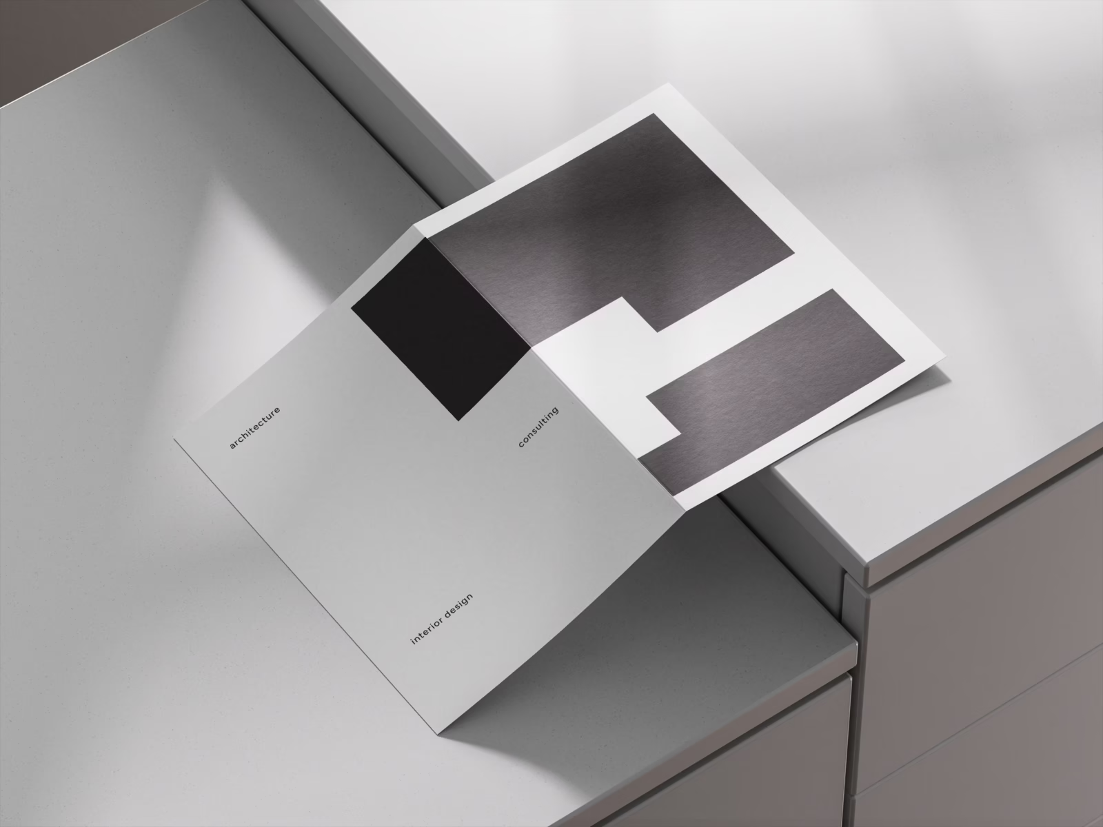
The logo created for Wiosna Architects forms part of a cohesive visual identity built around modularity. A flexible grid system ensures consistency across every medium while allowing the brand to adapt with ease. Inspired by 20th-century constructivism and the work of Jan Tschichold and Alexey Brodovitch, the design was refined with contemporary proportions to create a clear, distinctive and timeless image.
7r rebranding
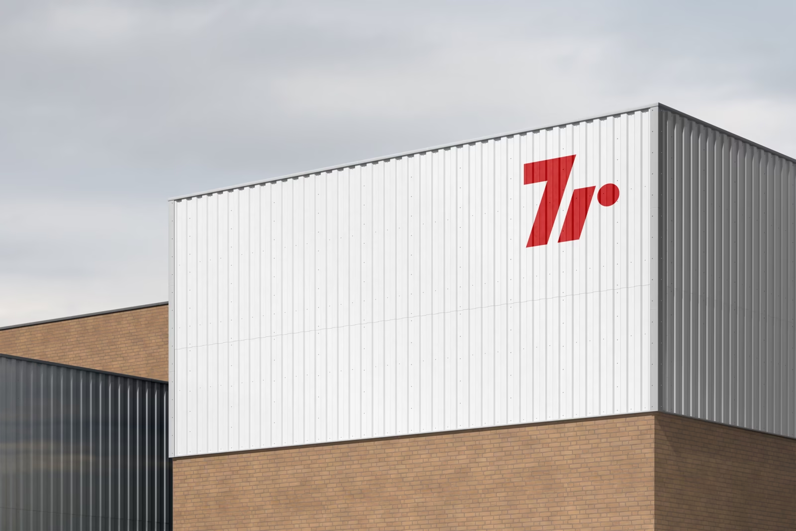
We completed a rebranding project commissioned by 7r, a developer operating in the commercial real estate market and specializing in logistics spaces. We were responsible for carrying out comprehensive global work aimed at creating a coherent brand image. Following an in-depth analysis, we identified the strongest elements of the existing visual identity and the features of the logo which, due to their high recognizability, we decided to adapt for the new mark.